By Kirse Junge-Stevnsborg in 2006.
Published in Paintings, catalogue by Trine Boesen in 2006.
The story of Chuang Tse’s dream is useful for describing the duality reflected in Trine Boesen’s double work The Butterfly Effect I and II. According to the story, Chuang Tse dreamed that he was a butterfly flying with other beautiful butterflies and living a carefree life. When he woke up, he asked himself, “Did I dream I was a butterfly or am I a butterfly dreaming I’m Chuang Tse?” In The Butterfly Effect I and II, Boesen thematizes this reflection on our understanding of reality.
The first painting is a skyline view of a city, the other a portrait of a woman and a car on the outskirts of a city. In The Butterfly Effect I, the foreground skyline is graphically rendered in black and white with empty fields. Behind a stylized figure, the city explodes in a riot of plants, patterns and symbols: a butterfly, a fly, stars, people, a radiator, hands with crossed fingers and a set of dentures, teeth clenched hard, with the contours of a skyline on both gums. In The Butterfly Effect II, the woman and car are graphically outlined on top of a large empty field next to two deck chairs and a big bird, while all around is an eruption of city, flowers, plants, roads, butterflies, helicopters, an unfolded Swiss Army knife, gift-wrap ribbons, wheels, a spider, a sign with a bomb and a hovering satellite universe.
The two paintings unfold two perspectives in one – two views of the city, two mental states. The Butterfly Effect I is a bird’s eye view of the city, while The Butterfly Effect II shows us the city from the perspective of the woman and car – from outside, from below. As in medieval perspective, the size and position of the pictorial elements are determined by their significance and symbolic value. The natural elements, animals and plants, are the same size as the houses. Nature and the floating elements can be seen as images of the activity and vitality of the city as an independent organism. By all appearances, the pictures are clearly powerful, riotous bursts of nature dichotomically shattering the controlled space of the city. On closer inspection, however, ambiguous and disturbing elements are seen to be breaking this stereotypical division of nature and culture. What is natural? Are humans and human-made things separate from nature?
The sign with the bomb, the row of anonymous human figures, the huge radiator (why is it so cold there?), the clenched dentures (are they devouring the city?), the overgrown plants and flowers (nitrate poisoning?), the Swiss Army knife (a utility for any conceivable situation), the hands with the crossed fingers (luck is needed?) and the black hole, the floating satellite universe. Taking the individual elements as symbols of social and psychological forces, the bird becomes a person waiting for the woman (but why?), the spider an individual standing apart from the butterflies and the helicopters (otherness?) and the houses, plants and butterfly appear to be fleeing from the dentures (but whereto?). Something is going on, but what remains a mystery.
Like the ethical social philosophy of Confucius, Boesen’s two paintings, like so many of her works, indicate that all actions and thoughts are significant. The Confucian social ethics prescribes a striving for Yen, social virtue/manners building harmony based on the ideal of do unto others. How do we recirculate behavioral patterns? Can social mores in one place shift because of activity somewhere else? Boesen explores the Confucian concept of causality and in the titles, The Butterfly Effect I and II, she links the paintings to chaos theory and non-linearity: a butterfly fluttering its wings in China can trigger an avalanche on the other side of the planet. The butterfly effect denotes a recurrent pattern of singular logic that was mapped in the 1950s by meteorologists studying apparently arbitrary, chaotic phenomena. By meteorological analysis, these phenomena over time started forming a graphic double-spiral pattern resembling a butterfly’s wings. Boesen, in her work, applies this meteorological logic to the Confucian social and mental logic of causality.
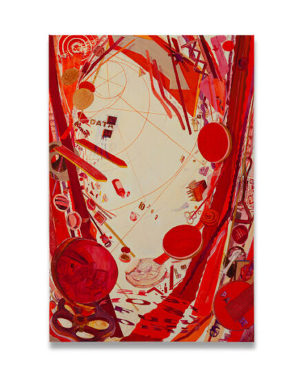
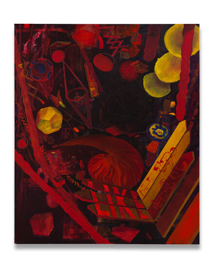
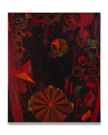
Boesen’s work questions our understanding of chaos. How do we aid in the production of common norms of chaos? Is chaos merely the designation for an as yet unknown form of organization? Is chaos culturally defined? In five images of our times – The Mind’s Eye, Adventure in Wonderland, Don’t Get Straighned by Reality, Concrete River and City Lights – Boesen likewise contrasts stylized, ostensibly ordered elements with a chaotic firmament of seemingly arbitrary everyday elements. Though the pictorial elements can be taxonomically organized into classes, types and species – people, animal, flowers and plants, buildings, artifacts and conventional symbols – Boesen asymmetrically jams the two picture planes (stylized and color saturated) up against each other according to a personal logic. The elements intermingle like chains of uncontrolled signs pointing to new signs. Like the philosopher Peirce’s evolutionary theory of signs stating that signs create new signs in a biological evolution and human evolution is linked to the cultural evolution developing concurrently.
Adventure in Wonderland can be seen as a mental journey as well as an anonymous sociocultural portrait of the city. A collective image of material goods, thoughts, actions, elements of nature, dreams and different forms of community. A collective unconscious. In an intensely red color dynamic, a universe forms around the city made up of water lilies and sewer pipes, darts and kisses, fleeing horses and parts of machinery, skulls and eggbeaters. The viewer is observing a whole at a distance, as figuration becomes fantasy, realism becomes hyperrealistic, futurism becomes and baroque becomes Gothic in a metamorphic process. In The Mind’s Eye, a female and a male face, looking straight out of the picture, return the viewer’s gaze. The viewer is included in the picture. Whirled into an urban jungle of drama, the viewer is directly forced to ante up his or her own associations. The unconscious is made manifest.
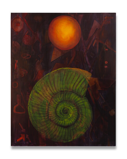
Boesen moreover gleans symbols from the Taoist understanding of nature and the concept of the natural, reciprocal order of all being things. Is our mental world of thoughts and fantasy natural? When is something real? Hyperreal? Surreal? Artificial? As the art historian Julie Damgaard pointed out in About Trine Boesen, 2002, Boesen plays around with the way we look at things, abruptly distorting a recognizable subject by abnormal proportions and angles, in no time morphing a semi-abstract figure into a lampshade or a phone. Don’t Get Straig’nt by Reality presents us with an image of a high rise. Behind it, as in the artist’s other works, the picture explodes with such symbols as mushrooms, butterflies, traffic lights, roads, nature, a spider, bats. The house is gestalted as organism. A portrait of someone. Are we witnessing a mental image of artificial intelligence? Or an image of experimentation with chemical substances in “robots” to achieve natural intelligence?
As in a Zen image, Boesen intermingle pairs of opposites (particles of Yin and Yang), binarily organizing the world into good vs. evil, light vs. dark, masculine vs. feminine. But she also questions that dualism by mixing up elements that traditionally are positively loaded (masculine) with negative (feminine) elements to make ambiguous statements. Concrete River and City Lights are chockfull of masculine vs. feminine power signs. In Concrete River, the street we find ourselves in as viewers looking in at the picture, is a dollhouse for the bride (an image of the perfect marriage). Absurd and funny. Threatening eggbeaters (female roles or chefs de cuisine?), helicopters (escape?), bridal bouquet of mushrooms (edible/poisonous?) and randomly cast dice. In City Lights, mass society’s consumerism comes bursting out of the city like a broken dam. Streetlights, ribbons, butterfly, lipsticks. The city itself is seen to grow on stars and grapefruits. Empty houses, empty thoughts, empty lives. Similar takes on the concept of masculine vs. feminine are found in several other Boesen paintings, notably a series of three paintings entitled Strange Days, Strange Nights and Kids in the Mist. The series can be considered as urban tableaux, presenting a three-act drama about the dream of true love where everything is not what it would appear to be.
Romantic elements are accented in a graphic line: a bride, intimate lovers. Contrasting these pictorial elements are widely different signals, including skulls (vanitas), mushrooms (potentially lethal/delirium), stag (masculine forces), cigarette lighters (fire), a mysterious man (father/criminal), putti (faith/religion), rabbits (breeding), butterflies (feminine forces), spiders (phobia?), sewer pipes (waste), a sign spelling “Fear” (warning), a sky in turmoil (stormy weather), jungle vegetation (the unknown/exotic). Each picture contains its own metaphor. As in a comic book, we get a fragment of an action, but without the option of flipping to the next panel. We merely get a sense of a string of threatening elements tying the three pictures together coordinately, metonymically. Strange Nights shows a woman holding a pillow in her hand. Did she just uncover the man’s face before leaning over to kiss him? Or strangle him? The lovers in Kids in the Mist seem undistracted by the neon sign spelling “Fear.” Fear of what? Love, the mysterious man, the brood of rabbits? The bride in Strange Days represents the schoolgirl fantasy of true love and the chance to be princess for a day. But what does the skull represent? Or the stag? Is the stag the groom, the masculine force, distracted by the butterflies? An instance of the ultimate bourgeois hunting trophy, a violent emblem of male dominance – pulp novels, flight of the stag, the traditional Danish coffee klatch?
In Oh Dear, the stag’s head hangs like a trophy on a wall of ornate, petit-bourgeois wallpaper. The main subject, the stag, is surrounded by a long line of pictorial elements drawn from Boesen’s universe of symbols. The stag is pacified and objectified. An image of social power struggle? Is the stag the loser in an indefinable game, stereotyped and locked in a role? Does the stag in this case represent femininity? The chain of associations stretches as far as imagination allows. In Oh Dear, Boesen explores the romantic idealization of feelings and fantasy – the salon painting of a stag, an idealized portrait, in which the beast functions as a psychological sign of man and the fabled creature becomes an image of ourselves. In Boesen’s version, the fabled creature is embodies by the stag – familiar, conventional, trivial and banal. In her animal-human parables, Boesen points out that there are signs of non-linearity in the animal kingdom as well. Species becoming extinct or undergoing significant changes happens according to recurrent patterns. When the fox population is low, for examples, the rabbit population grows. More rabbits mean more food for the fox, increasing the number of foxes and, in turn, diminishing the number of rabbits. Boesen is always twisting meanings and our symbolics (or, rather, letting us, the viewers, do the work). Like a showdown with romantic poetry, she tells stories she does not want to open, because she does not want them to close in on themselves.
Boesen shows us that there is never just one truth, but a multitude of levels, lenses, perspectives, visions and stories. Like Chuang Tse’s dream, Boesen’s pictures reflect on the schism in our understanding of reality: What is real/unreal? What is organized/chaotic? What is parallelism? What is image/counter image? There is always an image behind the image, like a postmodern riddle inviting the viewer to deconstruct manifold, ambiguous image layers – as Elisabeth Byre put it in Solitude Standing in the Urban Jungle, 2004. Boesen’s urban universe of imaginings, dystopias and dreams can be likened to an anthill – there is a lot going on. You may not notice it until you are standing right in the middle of it. You start envisioning a whole world inside of it. Social mores, community, behavior patterns, legal rules. A social order comparable to a mental process of the brain’s cells communicating and fostering activity, images and meanings. A microcosm within a macrocosm. Stir up the anthill and chaos ensues. Carefully rehearsed emergency measures are triggered. Just like humans adapting to change or acting under stress by biochemical adjustment.
Small things in the everyday may set off an avalanche of images and meanings – that is how Boesen describes her working process. She gets inspiration from magazines, music, popular culture, books, private photos, movies, artists like Louise Bourgeois, Raymond Pettibon and Andy Warhol, ’70s psychedelic visual experimentation and American feminism. In her artmaking method, Boesen draws on Pop Art’s sampling of signs, though always in “offbeat” aesthetic clashes of the mundane vs. the poetic, kitsch vs. beauty, mass culture vs. bourgeois emblematics. Humor and satire. Elements of neofiguration, a new sensibility and neo-Gothicism wrapped up in an expressive and ornate formal language. Trine Boesen’s works are equal parts graffiti and tile painting.


 parajumpersonlinestore


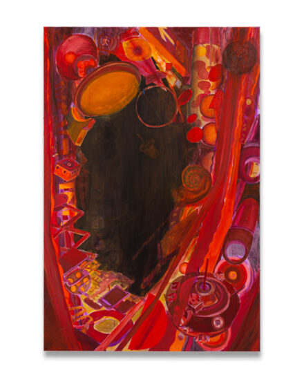
 - 150 x 100 cm -Acrylic on canvas - 2004")
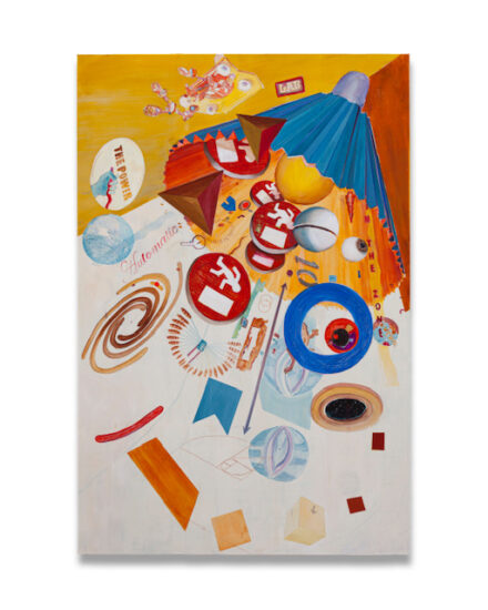
 - 150 x 100 cm - Acrylic on canvas - 2004")
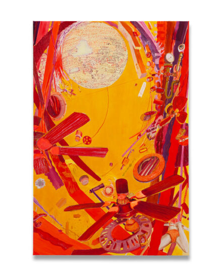
 - 150 x 100 cm - Acrylic on canvas - 2004")

